 The homebuilding industry is constantly having to pivot and adjust to the real estate landscape because keeping up to date with the latest marketing strategies and tactics is crucial. Based on Mandy Holm’s Tech Bytes session at the recent International Builders’ Show, this blog offers tips for selling new homes off the Instagram grid.
Does Instagram Really Matter?
With an estimated 1.41 billion users, Instagram has grown to be one of the world’s biggest, most-influential social media platforms in the world. According to BusinessInsider.com, the average homebuyer is 45 years old, but about a quarter of buyers are in their 30s. BusinessOfApps.com reports 70% of Instagram users are under 35-years-old, meaning now is the time for home builders to get in front of these potential future homebuyers.
While Facebook still reigns supreme when it comes to driving website traffic with Americans spending an average of 58 minutes a day scrolling, research shows there is a decline among younger users, who are increasingly drawn to other apps including Instagram and TikTok. According to Forbes.com, Instagram was the second most-used service with users browsing for an average of 53 minutes a day.
Human Content is King
In a world where consumers find it tough to trust companies, it is important to humanize elements of the social media strategy. It is about familiarity, not predictability, and a humanized brand makes consumers feel like they have known the company for years – and that begins with content.
So, what makes optimal Instagram content? If 2020 and 2021 taught us anything, it’s that people need people. We’re social animals, and thus seeing people — even depictions of people — makes us more comfortable. It helps the viewer relate to your brand, and posts with faces receive 38% more likes than posts without, but beyond posting a stream of selfies, how do you strategically humanize a home builder brand?
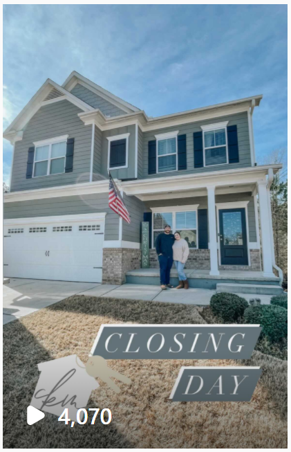
Consider sharing the faces behind your brand or re-sharing user-generated content – they tag you for a reason! Have agents snap a pic of new homeowners on closing day. Make a small investment in branded signage for those happy homeowners to hold. Putting a face to a company is a great way to humanize a business and build strong relationships with returning customers.

Interactive Posts > Salesy Posts
Many consumers would agree they use social media as a means to escape, mindlessly scrolling past a lot of sponsored or salesy content – except for the brands they feel a connection or sense of loyalty to. Stop potential new buyers in their tracks with unique content that is not constantly trying to sell something. Interacting through funny and trendy posts is almost as important as business-centered posts.
Authenticity is Key
Remember to be authentic in photos, captions and responses. That’s not to say you shouldn’t engage and interact in a “product-oriented” manner but be conscious of over-promoting products ALL the time and try to respond to comments in unique ways.
The Big 3
Ultimately, we’re here to sell homes. If you learn anything from this blog let it be these three things:
- Professional Photography
- Stop the Crop
- It’s All About Balance
Professional photography is a must in home selling but especially on a visually driven platform like Instagram. Do not post a horizontal image that will look awkwardly cut off in the square profile grid view and be sure to balance your grid by strategically alternating between interiors, exteriors, close-up details, living spaces and those photos with faces/people. Should buyers click through to see your full profile, you don’t want them to only see exterior renderings or similar interior shots, so switch it up!
Beyond sharing your most beautiful photos, there are a few more things to consider for those impressions to turn into engagements:
- Location, Location, Location!
- Posts With a tagged Location Get 79% more engagement.
- Emojis: Use when appropriate to break up text and show brand personality.
- More than half of Instagram Captions & Comments Contain Emojis.
- Hashtags
- Posts with at least one hashtag average 12.6% more engagement.
- Video
- Get over 2 times more engagement than Instagram photos.
As video can get expensive, there are free computer programs you can use to create slideshow-type videos of photos when actual video footage is not available, and in the Denim team’s experience, they perform really well!
Below is an example of a slideshow-type video created in iMovie, a free app available on Apple products. It is super user-friendly and comes with a handful of royalty-free music options.
Notice the centered copy, so that when this video was posted to the client’s Instagram, nothing was cut off in the grid view. We also boost these through Business Manager to cross deliver on Facebook and Instagram, so we try to keep them below 30 seconds and they garner impressive results every time.
What the Hashtag?
You didn’t think we were just going to breeze past hashtags, did you? The entire Instagram platform is only built around them, so they definitely matter.
Hashtags help increase a post’s organic engagement, reach and visibility, but it’s not as simple as using whatever hashtags you think of and seeing what sticks. Hashtags need to be specific search terms that have the most usage and are driving the highest engagement.
Make sure you are being strategic when selecting the right hashtags for your brand. While you can use up to 30 hashtags per post, that doesn’t mean you should. We recommend using between nine and 12. Search relevant terms on Instagram and use the ones showing the most usage.
Sprout Social has some excellent hashtag tips as well. You can even use hashtag apps or extensions in your web browser for inspiration – try Hashtag Expert or RiteTag.
But where to put that many hashtags? Sprout Social recommends only using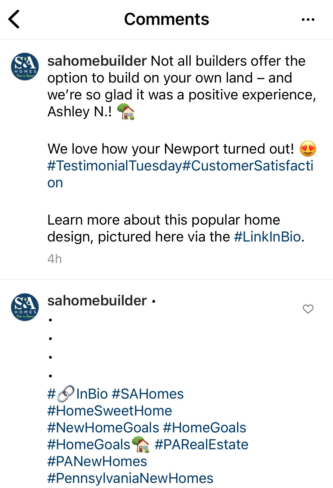 one to three if posting them within a caption. Any more than that can overwhelm the post in its entirety and make it look messy, so simply move the hashtags to the first comment of the post.
We like to add those 5 dots to create line breaks in the comment and not show a preview of the hashtags on the frontend of the post.
Creating a Cohesive Instagram Grid
OK, let’s dig more into the grid. Your Instagram aesthetic is the first thing potential customers notice when they check out your brand’s profile. It conveys your brand’s voice, personality and helps followers instantly recognize your content when it appears on the feed.
The color scheme, tone, layout and overall feeling of your Instagram page contribute to an aesthetic that can either gain a new follower or cause them to click back.
Top three components to create a cohesive Instagram grid:
- Respect the square
- Determine grid layout
- Utilize presets and a consistent color palette.
Square is No. 1
The powers that be at Instagram determined the most appealing format is square. Square logo, square pictures, square ads. All this squareness was bound to lead to a square grid format for each profile, so be aware of the preferred shape and crop your photos ahead of time in Canva or Paint.
I’m going to pick on some of our own work where we did not create images optimized for the Instagram square.
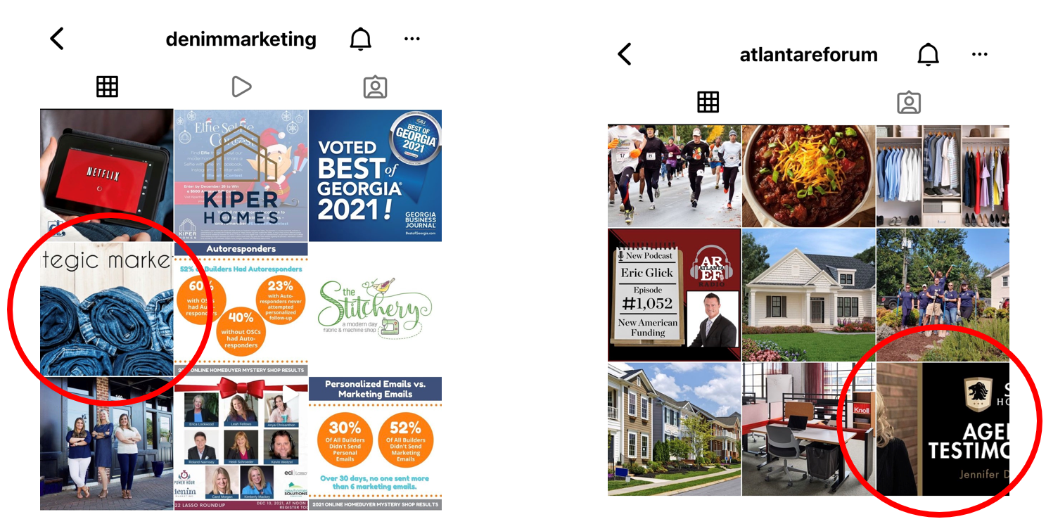
Yes, the image on the left is our own Instagram, but we’re human and we learn from mistakes. Alternatively, the image circled on the right was unavoidable as it came from a client to post to our news site.
If you have to post a horizontal image, be sure to tap the zoom-out option to alter the posted ratio size, circled in the left image below. That way, the image will appear correctly at least in the feed. Just be aware, that Instagram will still square crop it to the center of the image for the grid preview, which can leave important features cut off and look sloppy.
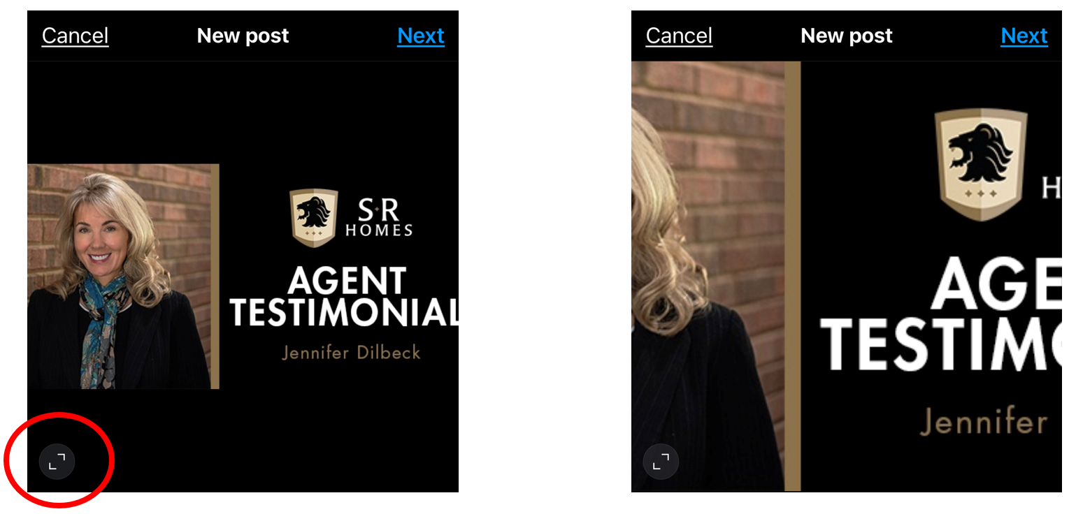
Unfortunately, for this particular image, if we’d cropped it all the way to the left, you’d have seen more of her face in the grid view, but the letters would have cut off with no way to see it in its entirety.
Failure to Plan
You know what they say: Failing to plan is planning to fail. When creating social media graphics, go ahead and create a square version that is optimized for Instagram.
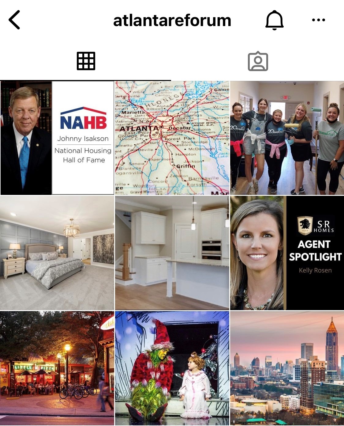
You’ll notice the images from the below screenshot are optimized for the square with no cut-off faces or text.
Decision Time: Grid Layout
Beyond respecting the square crop, somebody eventually saw the big grid picture as an opportunity to create art. From there, it was just a matter of time until people and brands jumped on the bandwagon to create puzzles, quotes, tiles and so on.
When it comes to selecting a grid layout, there are tons of options:
- Puzzle
- Row by Row
- Vertical Text Line
- Checkerboard
- Border Grids
- Diagonal
- Rainbow
- Mixed Square
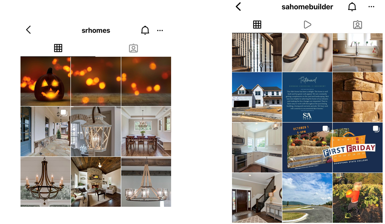
The puzzle layout, pictured below, is one of the hardest to maintain.

Basically, it features a single image split into multiple ones. For homebuilding, we don’t do it very often simply because of how difficult it is to maintain – you don’t want your entire grid to be a bunch of mixed-up puzzles, so only do this every so often.
There are also several options to evenly split a picture for this. PhotoSplit is free in the App Store.
Next, we have the row-by-row layout. Similar to the puzzle, unless you plan on always posting three images at a time, you just have to be OK with these puzzles not lining up sometimes. A seasoned Instagram user will take one look at that and know there must be more to come to line it up.
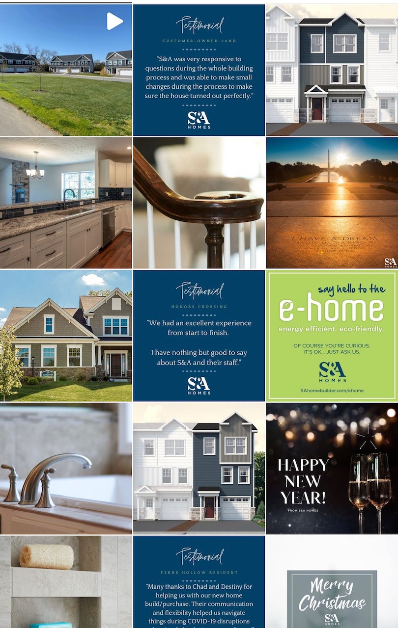
Another popular one is the vertical text line layout. You’ll notice the Testimonial graphics line up vertically here. Some accounts make this a consistent vertical line, but the one below features more of a checkerboard, every other row pattern.
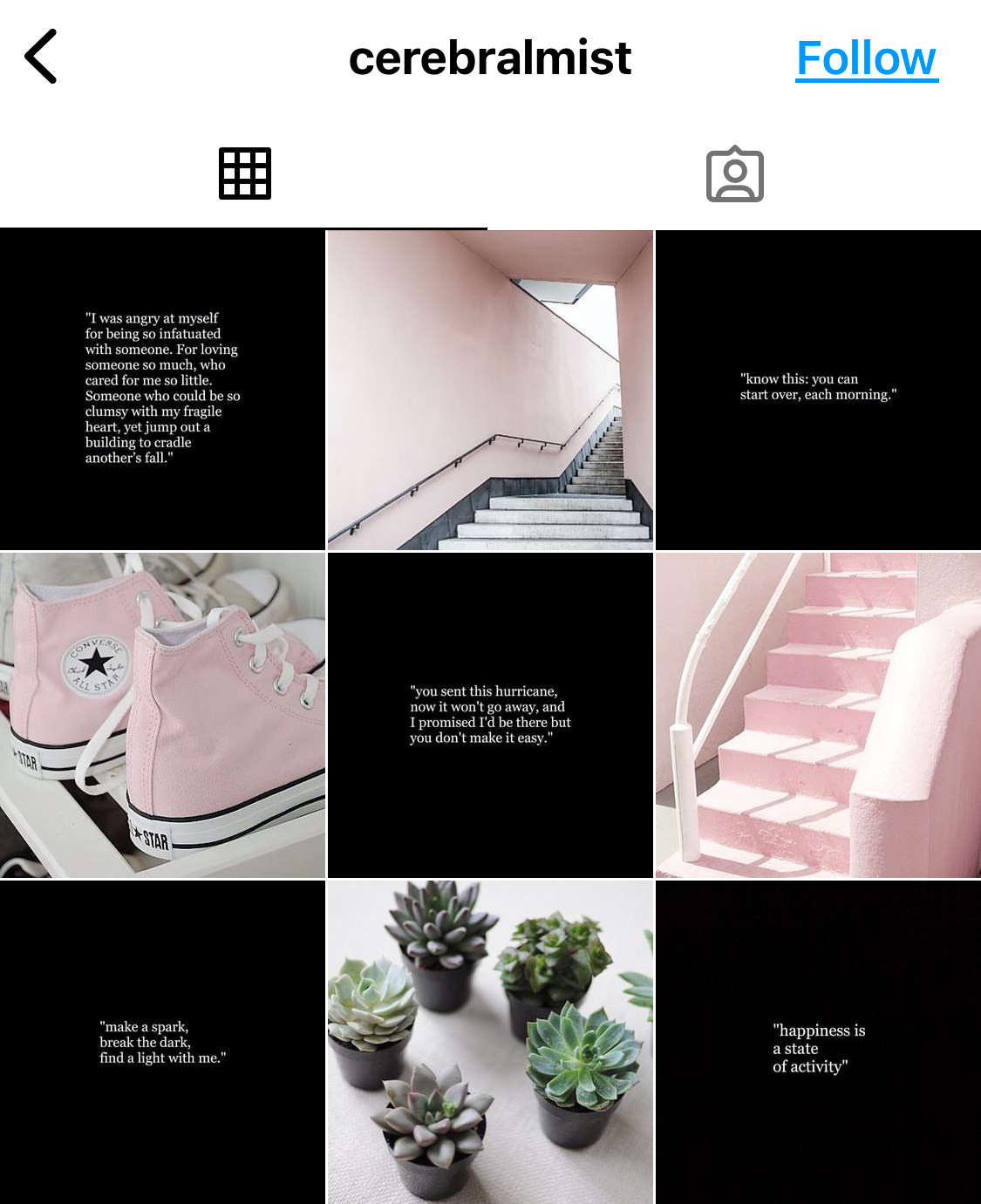
Speaking of checkerboard, here is an example of what that looks like:
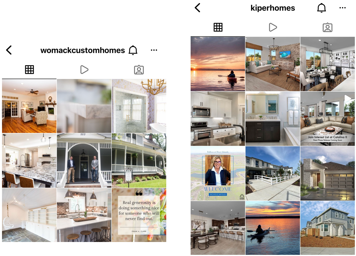
A personal favorite for homebuilding is the simple mixed square. This grid layout is the best option for businesses that would interrupt a specifically planned grid view (you never know what’s going to come up or need to be pushed when it comes to homebuilding!)
Pick a Preset or General Color Scheme
Beyond respecting the square and determining a layout pattern, the next step to create a cohesive Instagram grid is to use a complementary color scheme – kind of difficult in homebuilding when you’re featuring different models with unique color palettes.
The solution? Use the same filter or preset for all your photos! A preset is just a fancy name for a photo filter! Presets are filters, but filters are not necessarily presets because technically speaking, Preset is a term specific to Adobe Lightroom. They help do the bulk of your editing work and can be a great option if you’re not looking to edit from scratch, or if you’re new to photo editing entirely. Photos and backdrops might differ – but a cohesive color palette can help bring it all together.
If you want to branch out from the included Instagram filter options, explore preset options on Etsy. There is a wide range in prices, but just because some cost more, does not mean they are superior! To pick one, look at the interior and exterior shading and what colors really pop. You also might have noticed some of the options pictured here include 3, 10 or 15, which just means your purchase includes that many preset filters that complement each other, so you can pick which looks best per photo.
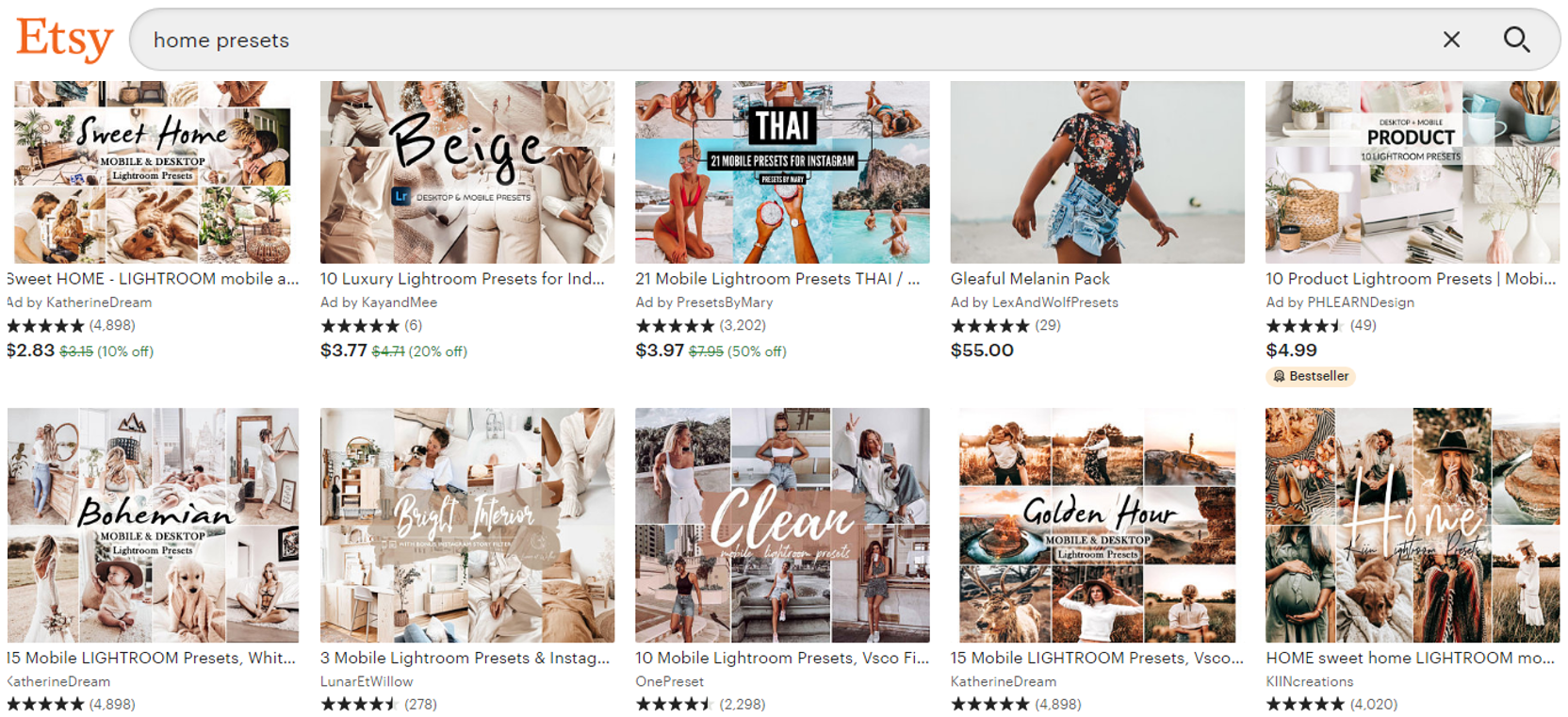
Presets also come with step-by-step instructions on how to use them in Adobe Lightroom, which is extremely user-friendly and free in the mobile App Store.
Applying a preset is the final step in the editing process. It helps tones come together and keeps them consistent. Some include muted highlights and a more monotone palette, while others offer a darker, moodier vibe. You just have to decide what works for your brand.
Yay or Nay on a Curated Instagram Feed?
Pros
It makes a great first impression, which can increase the percentage of people who follow after visiting your page. It also allows you to bulk create content and schedule everything in advance. Then of course, the obvious, it is seamless and visually pleasing, something not everyone can achieve, so it can make you stand out from your competitors. Looks like you might know a thing or two about Instagram.
Cons
Of course, not every strategy is perfect…Some people are beginning to favor real-time content over perfectly curated content. Something that looks great on Instagram, might not deliver the same message on Facebook or LinkedIn. Posting three times in a row might look spectacular on the grid, but it’s not as visually striking in the newsfeed. And, for those truly committed to maintaining a specific grid layout, you lose the flexibility of posting breaking news and having to share it after the fact.
It comes down to what your specific goals are for your brand.
What’s Changed + What’s New?
How to Share Multiple Images
This might seem really basic, but in 2020, Instagram changed the way it looks when you share multiple images.
You can still share up to 10 photos in a carousel and the ratio that you select for the first image will apply to all of them.
Simply select the multiple photo icon, then you can select up to 10 images from your Camera Roll…
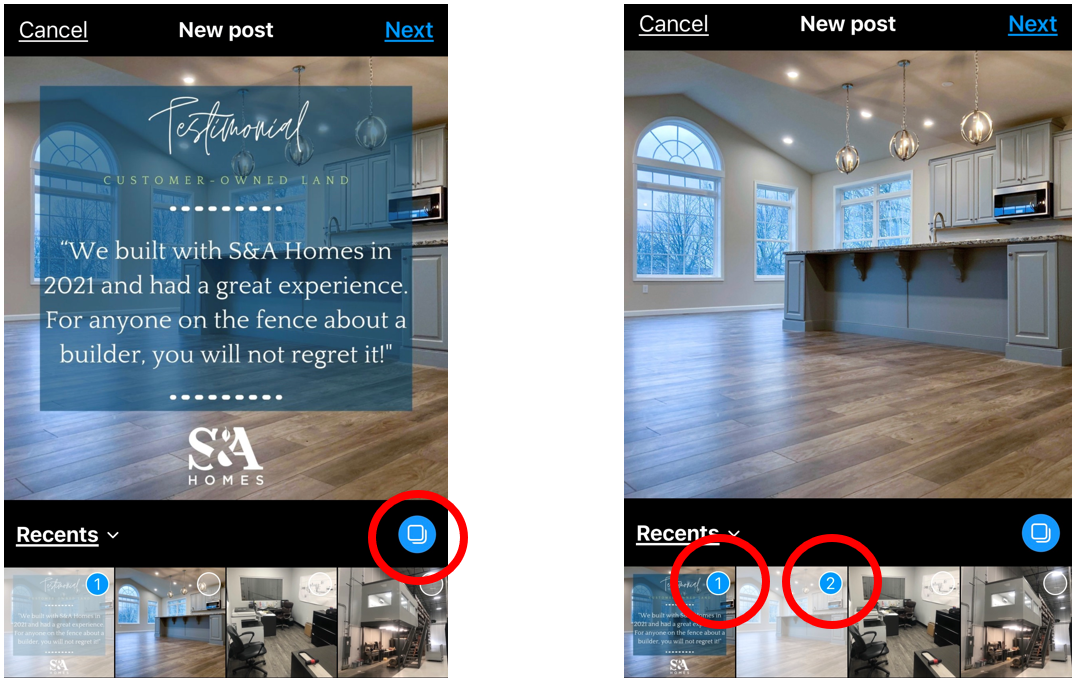
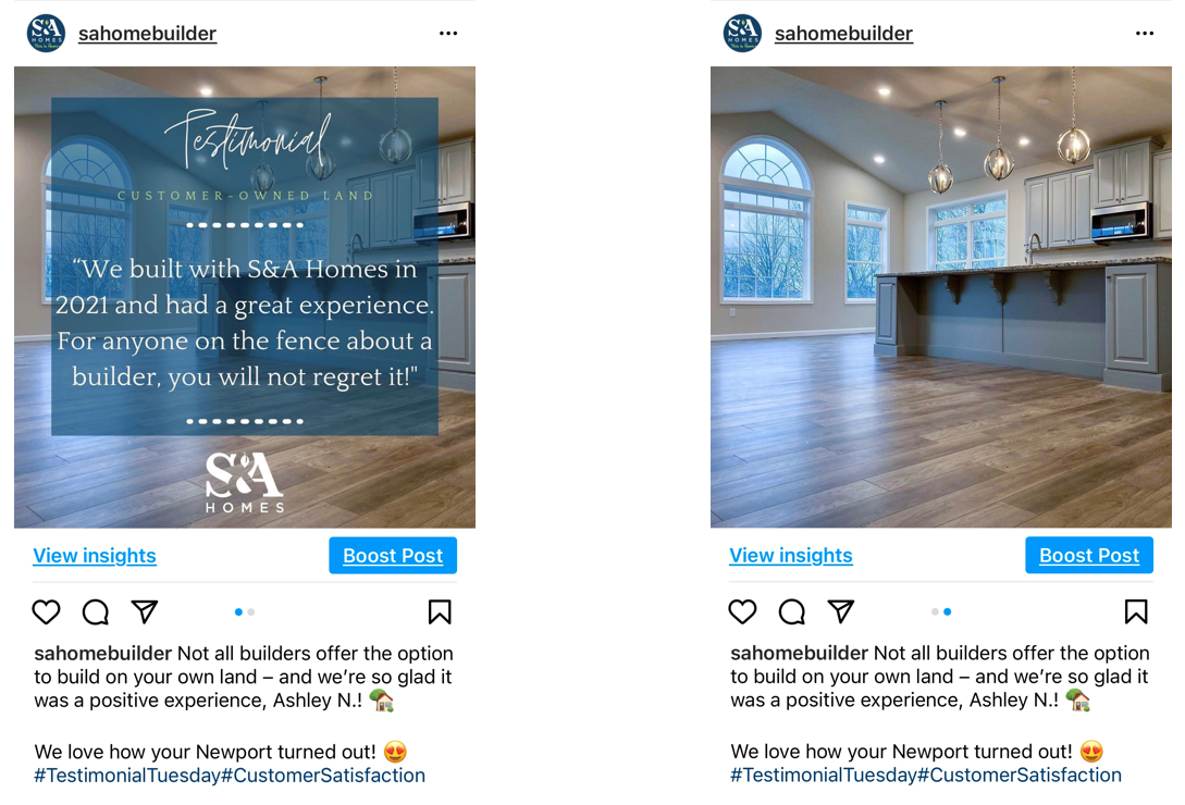
Enter your caption and post as you normally would, and this is the finished Carousel. For this one, we only did 2 photos.
Should You Reel-y Use Reels?
Also in 2020, Instagram introduced Reels to compete with Tik Tok.
These short videos can significantly grow your fan base by increasing reach, upping engagement, showing brand personality and, most important, recommended reels appear on the Explore page, where users who aren’t following you can see your content.
Click here for a good example of using Instagram Reels to sell homes.
How to Go Viral
 The bottom line is that you or someone on your team needs to learn how to create Reels. Top tips for creating a successful reel include:
- Use trending audio. Spend 10 minutes exploring suggested Reels and you can figure out which are the most popular right now.
- Aim for 30 to 60-second reels versus only 15 seconds. That seems to be the sweet spot.
- Set an eye-catching cover image – it’s still all about that grid! That first impression could be the last impression, so make sure your Reel cover image clearly conveys what it is about.
Finally, mix up the Reel content to include new listings and inventory homes but also branch out in showing your company’s personality by teaching your audience something.
Click here for basic instructions from Instagram on creating Reels.
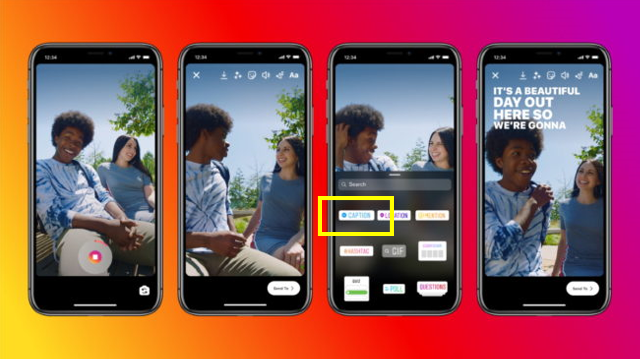
Auto-Captioning Sticker
One update Instagram introduced in 2021 was the auto-captioning sticker. This sticker can transcribe a recorded video story or the audio in an uploaded video. This is an amazing update in the world of accessibility, allowing viewers to read real-time subtitles.
So, what’s the point?
As with all marketing efforts, what is the ultimate goal? Whether online or in your sales centers, we want to see some traffic, but how do we drive traffic from Instagram since we can’t put a clickable link in each post? Outside of Facebook ads that cross deliver to Instagram, your options are the #LinkInBio and/or the new Link in Story Sticker.
A Dedicated Instagram Landing Page
Instagram used to show posts in chronological order, but in 2017, the new algorithm switched the order of posts on users’ feeds into what it thinks each user will like. Since then, many brands have begun using a dedicated Instagram landing page on their website that displays all Instagram posts and their individual links.
The beauty of this is that the link in bio remains the same, so you can beat the new algorithm. For example, if you post multiple times a day or even once every three days, people that don’t browse on an hourly or daily basis and otherwise would see posts out of order, are not clicking a now irrelevant link.

Something to note, however, a dedicated Instagram landing page can be time-consuming as you need to be a desktop to make the updates unless the website is editable on a phone, and posts are not schedulable as there is no automatic option to pull the Instagram feed through to a website.
Link in Story Sticker
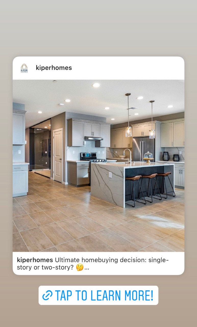
The Link sticker allows you to add a link directly to your Instagram story. When people tap on the sticker, they are redirected.
When Instagram first introduced Story link stickers, the feature was limited to verified accounts or those with a certain number of followers, just as its predecessor, the “Swipe Up” was. For whatever reason, Instagram actually listened to its community, that we all want to share things that matter to us. Whatever you’re into, from cooking to shopping, you now have a space to share in Stories — regardless of account size.
New Feed Order Options
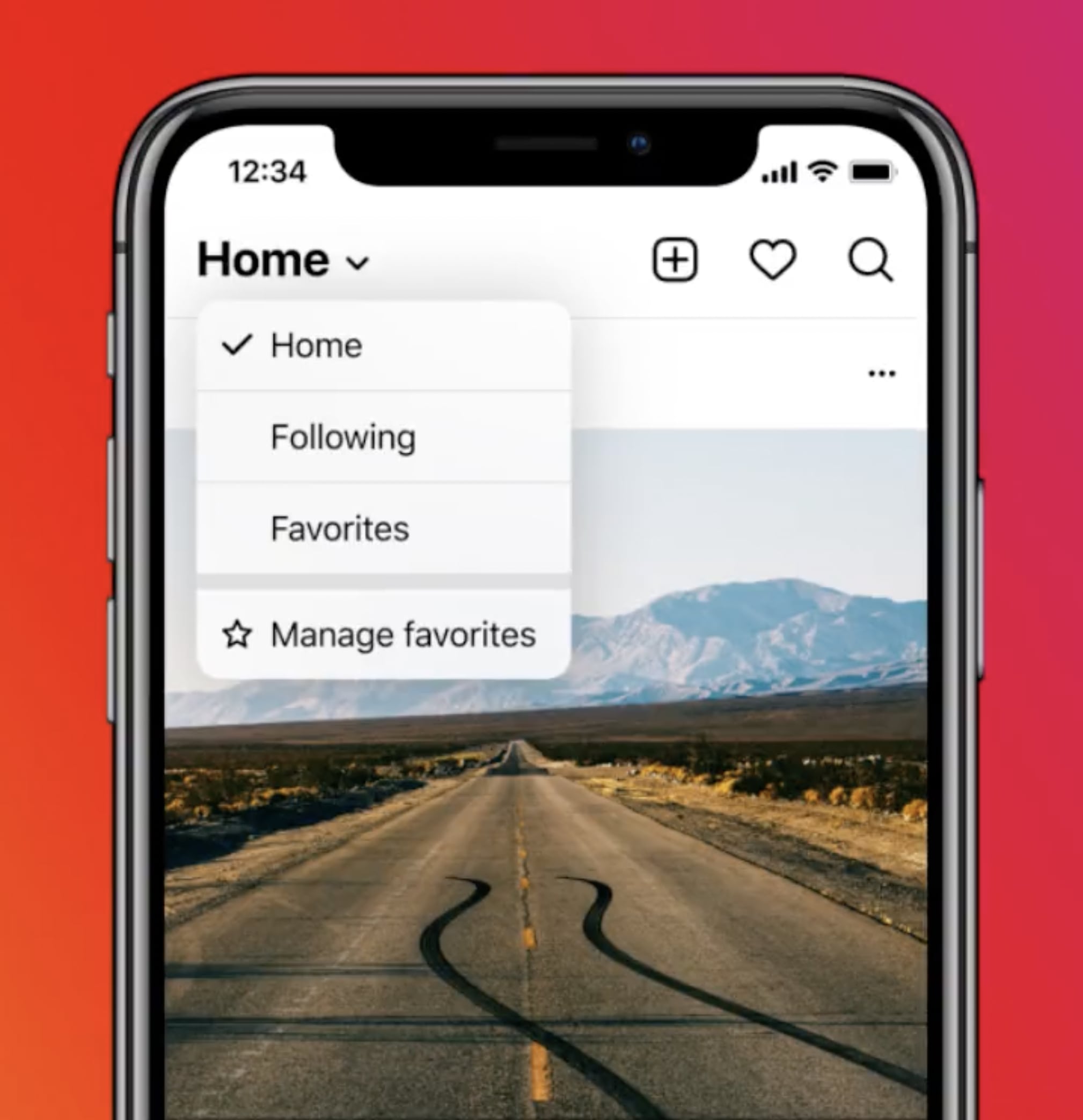
The platform is also currently testing three new feed order options, allowing users to toggle between the algorithm-based “Home” feed, the “Following” feed which will represent the app’s original chronological order and finally, the “Favorites” feed which will include a smaller list of accounts whose posts you personally don’t want to miss.
Our advice? Work with a marketing team that is experienced in selling new homes off the [Instagram] grid! Consider partnering with the Denim Marketing team for strong social media content strategies and best practices to improve online engagement for your brand. For more information, call 770-383-3360 or contact us.
Leave a Reply